 Go Back!
On making icons
A while ago, I covered the CSS aspects of my approach to making icons. However, I have not covered thus far the image editing aspects of it. To make sure I don't forget the exact steps I followed, I will note it down here. I will use the GNU Image Manipulation Program (GIMP).
For example, the Mastodon icon which I use on my homepage:
![]()
To make sure some icons don't stand out too much from others, I always follow the same procedure:
- Grab the original full-size icon
- Resize appropiately. In my case, I resize it to 28x28 (I want it to be 32x32, but later I will add a 1px white outline and a 1px black outline, so I need to make it slightly smaller first). I want it to look pixelated, so I will pick "Interpolation: None". Other methods may make it look blurry. I want it sharp and pixelated.
- Resize the canvas to 32x32
- Select the icon (usually I select the transparent part and then invert the selection)
- Create a new layer and grow the selection by one pixel. Paint the entirety of the selection on the new layer white. Put new layer under icon layer
- Create another layer. Grow selection one more pixel. Paint the entirety of the selection on the new layer black. Put black layer under the previous layer
And that's it, new icon.
On dithering
At some point during my time at Neocities, I decided to follow an unwritten rule of sorts regarding images and graphics: they can either be small, pixel-art-esque and simple, or they can be complex but dithered. Screenshots of my projects are exempt from this rule.
Take for example my icons. They're small, they're pixelated, they're usually pretty simple, with a small color palette. No dithering for them.
Now let's take a look at the media section of my homepage, where I share some of the media I like. Specifically, let's take a look at the cover image I used for Resident Evil 3:
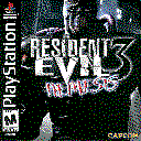
It is not only sized correspondingly to its section (each section has a different cover image size), it is also dithered. Using GIMP, the specific config I use for my images is: Floyd-Steinberg method, 3 3 3. I may have used the Bayer method on some images before, but usually I pick Floyd-Steinberg.
On JavaScript
On my personal website, my principle is that disabling JavaScript should never break the site. At most, visitors would lose a few non-essential features, such as theme switching or the Casio TV, while the rest of the website remains fully functional (excluding some tools I made like the YouTube thumbnail grabber).